Logo
Logo is the basic element of the visual identity. The construction, proportions, shapes and colors of the logo must not be altered. The logo should always remain legible and protected from other elements.
Positive and negative
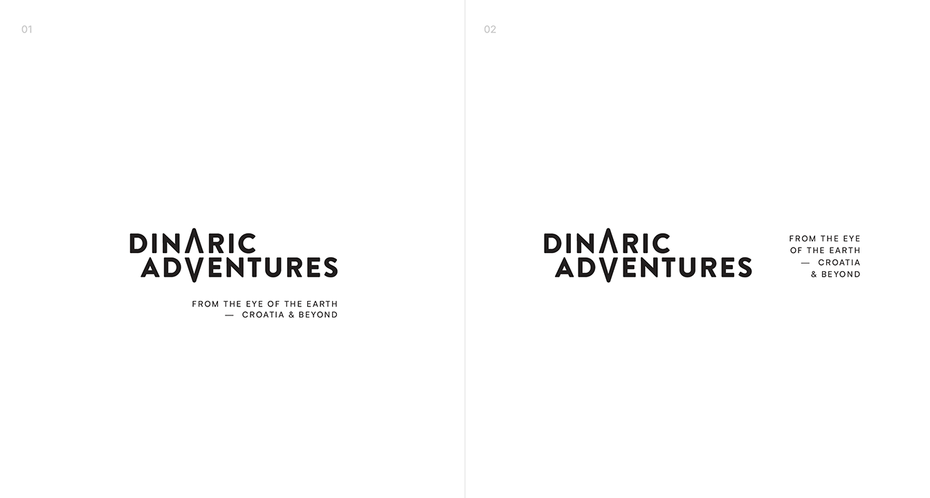
Logo with tagline
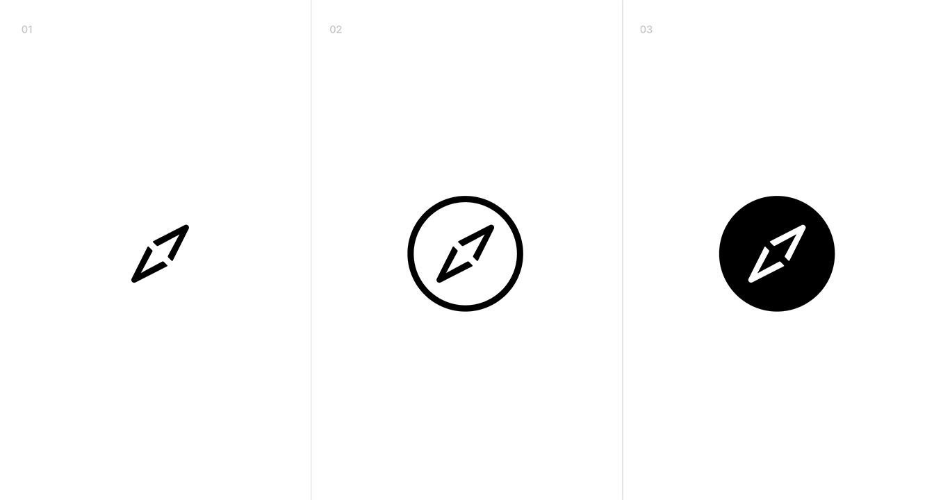
Symbols
Symbols are derivatives of the basic logo, and are used independently, as a detail within compositions or when there is no place for the basic logo, e.g. favicon
Colors system
The color system consists of two equally important primary colors (Dinaric Black & Dinaric Rock)and 4 secondary colors (Dinaric Indigo, Green, Sunray and White).
Main color combinations are between the two
primary colors while the secondary ones are used as supplements but also as important part of the visual identity.
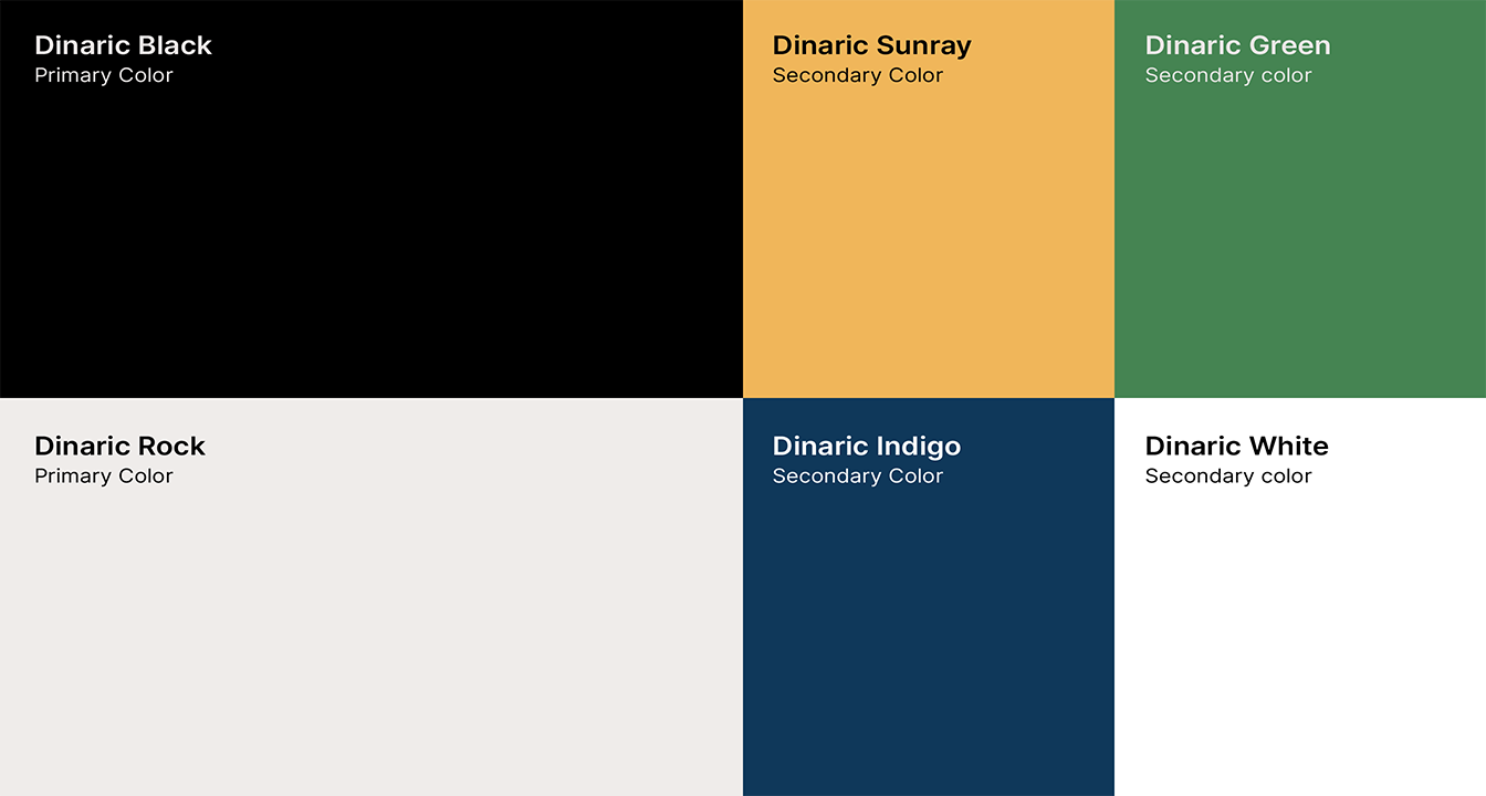
Dinaric Black
#000000
R0 G0 B0
C0 M0 Y0 K100
Pantone® Process Black
Dinaric Rock
#efecea
R240 G182 B90
C5 M5 Y5 K0
Pantone® Warm Grey 1 C
Dinaric Sunray
#f0b65a
R239 G236 B234
C5 M30 Y75 K0
Pantone® 135 C
Dinaric Green
#458452
R69 G132 B82
C76 M27 Y83 K11
Pantone® 7739 C
Dinaric Indigo
#0f385a
R15 G56 B90
C100 M79 Y40 K31
Pantone® 648 C
Dinaric White
#ffffff
R255 G255 B255
C0 M0 Y0 K0
Pantone® /
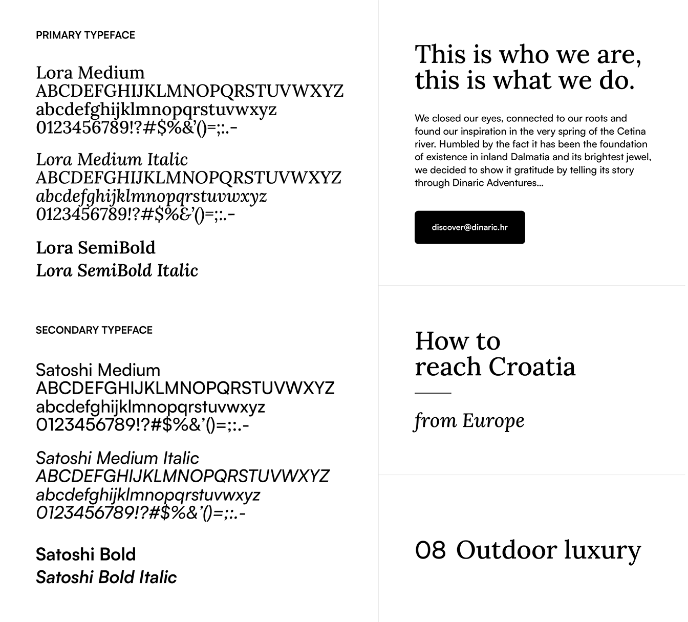
Typography
The typography system is based on two typefaces: Lora – in Medium, Semibold weight and Satoshi – in Medium and Bold. The Lora is meant to be used as a title font and Satoshi as a body text font. A clear hierarchy between text elements (size, color and weights) as well as optimum legibility (leading and column width) should always be kept.
Color Combinations
The color combinations shown are preferred within the system and others should be avoided for recognizability and legibility.
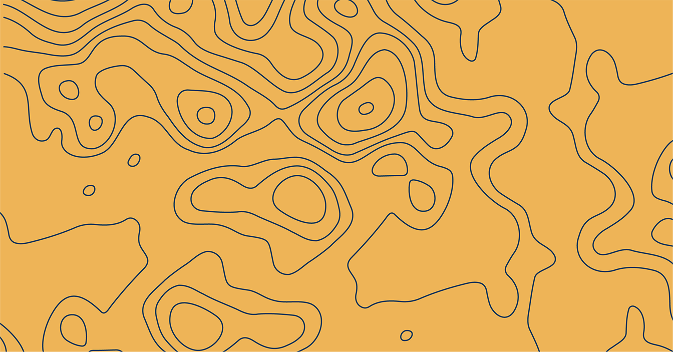
Patterns
The color combinations shown are preferred within the system and others should be avoided for recognizability and legibility.

Logo on photos
When used on photos or other graphical background, make sure the logo is clear, protected and legible. Always use the logo on a backgrounds which ensure enough contrast and legibility, sized at the minimum as the protected area (see construction below).
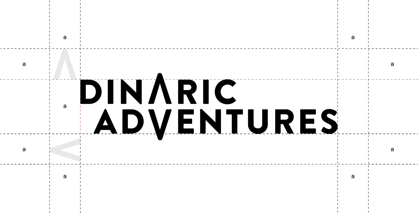
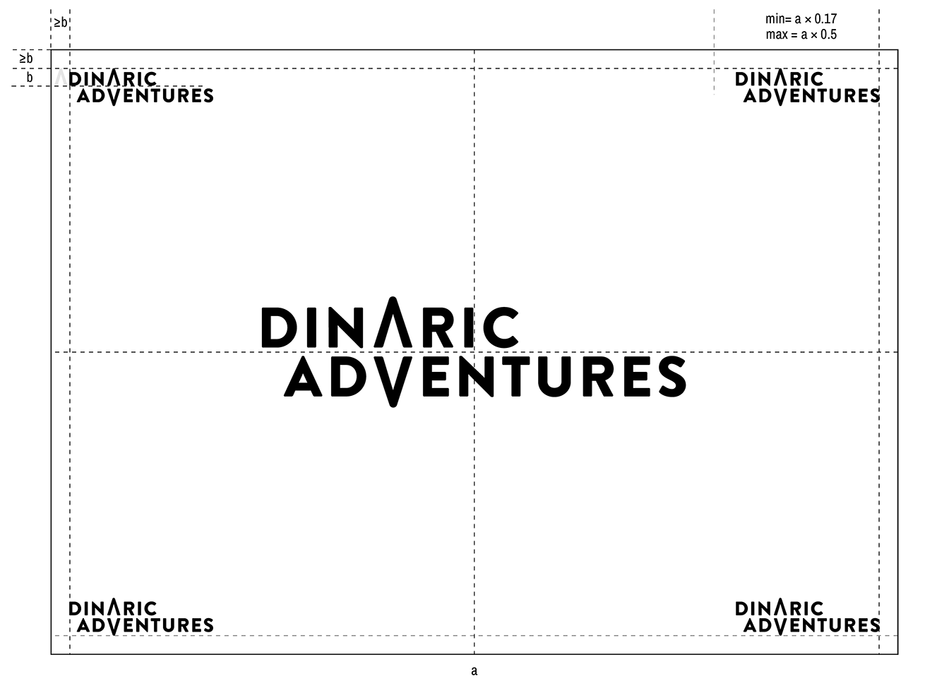
Protected area
The protected area around the logo is defined by the module from primary logo. To ensure maximum legibility and protection, within this space no other graphical or textual elements should appear.
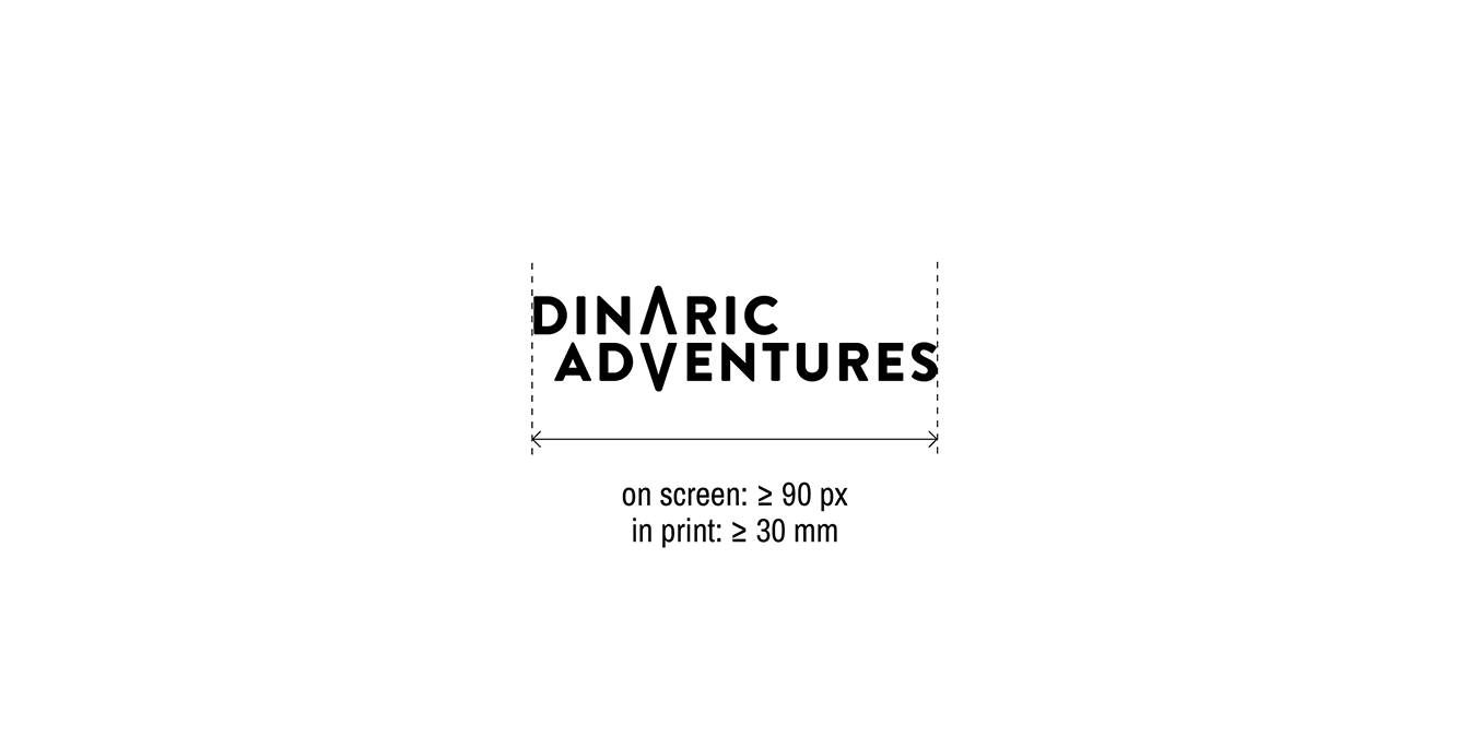
Minimum size
The logo is not to be reproduced in sizes smaller then defined.
Positioning
The logo can be positioned in any of the corners or centered within the format, sized appropriately, while centered logo could be bigger.
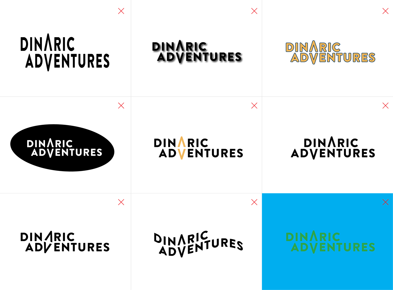
Incorrect usage
The logo and other elements of the system should never be altered in any way, e.g. by changing the shapes, proportions, colors, fonts, rotating or skewing, adding shadows or outlines, or any other additional elements within the logo.
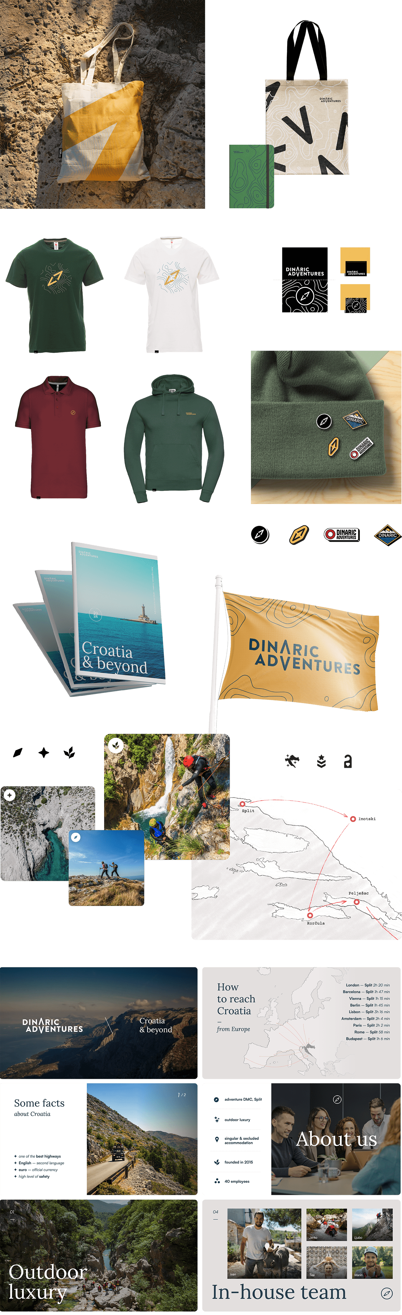
Examples of applications
The visual identity system can be manifested in different ways which makes it instantly recognisable while also flexible. Pictured below are several examples of its possible applications.